Djidiawax, Online shop in France: what changed
Rebuilt a fashion shop for phones: pages 10 times lighter, checkout fixes, photo reviews, clearer signals for Google. Results to come.
Disclosure: the owner of Djidiawax is my sister.
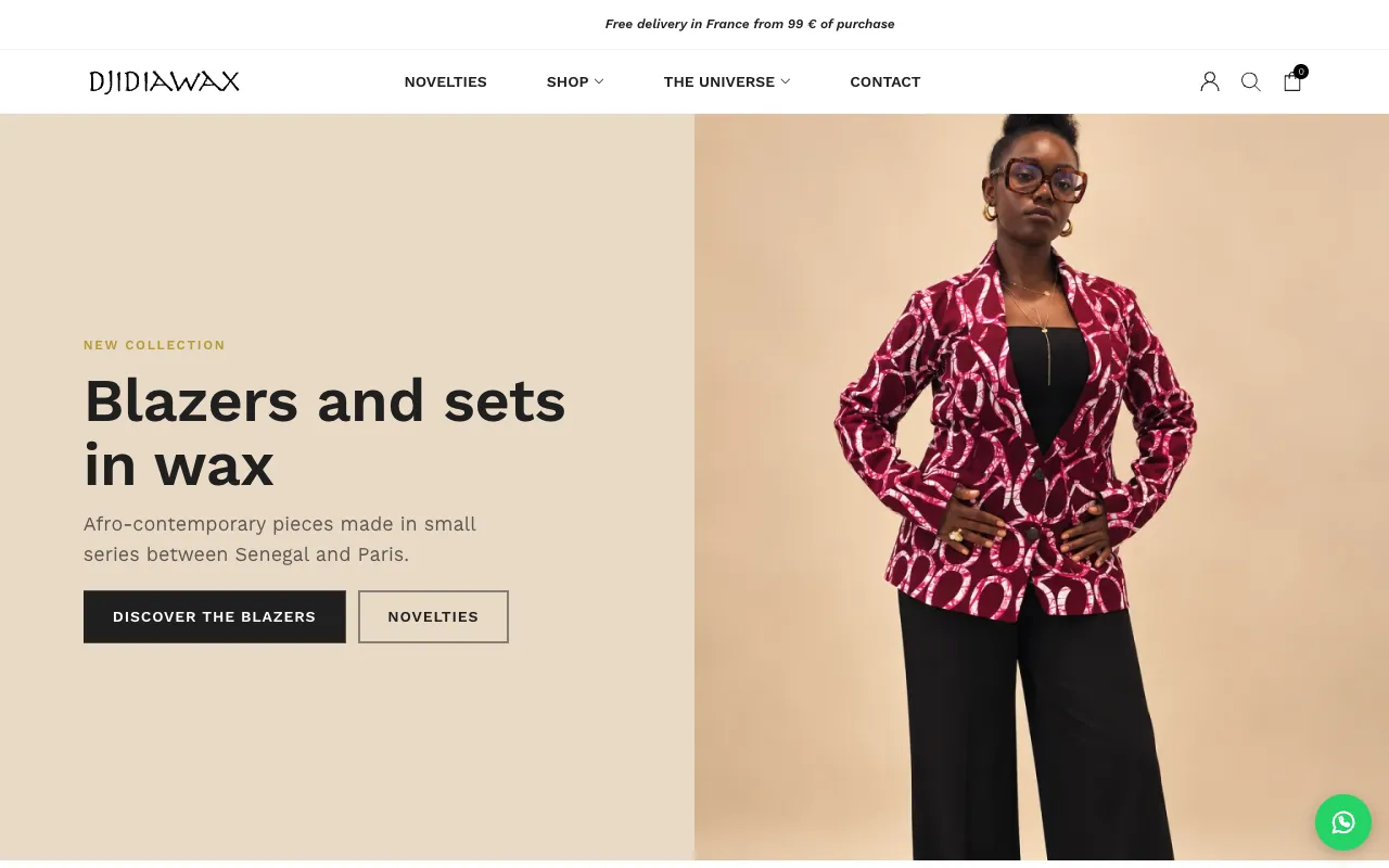
The shop
Djidiawax sells afro-contemporary clothing online from France: blazers, sets, jackets, and tops made with wax prints, in small batches between Senegal and Paris. The shop runs on WordPress and WooCommerce, and most visitors shop on a phone.
Before
The photos were good, but the shop lost people on the way to checkout:
- Free delivery was promised but never applied. The banner said “free delivery from €200,” but checkout still charged shipping.
- Pre-orders couldn’t be paid for. Five sets on pre-order only had an email form.
- The theme’s sample content was still live. The contact page showed the theme’s English text and US phone numbers, and 16 sample blog posts in English were sent to Google.
- Dead ends. Buttons and 11 menu links led to empty pages.
- Heavy pages. Product photos were saved as PNG, a format made for logos: one 800-pixel photo weighed 1.2 MB. Pages weighed 6 to 9 MB, which is slow on a phone.
- Weak signals for Google. Every category page had the same title, and some products weren’t in any category.
What I did
Speed
- Served the photos as WebP, with no visible loss. The originals are kept.
- Turned off 8 plugins that weren’t needed. A product page now loads 73 files instead of 127.
- Added a page cache, so pages are ready before anyone asks for them (except the cart, checkout, and account pages).
Pages went from 6–9 MB to about 0.6 MB, measured on October 21, 2026, on the same pages, logged out.
Home and product pages, phone first
- Home page: the first screen now shows a real blazer from the shop, what the shop sells, and two buttons. Before, the first product came after four screens.
- One typeface across the site, instead of three.
- Product pages: bigger size buttons, a size guide, delivery and returns right under the button, and a payment badge in French.
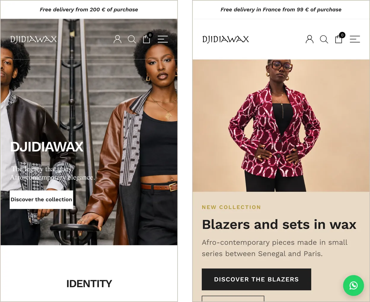
Home page on a phone. Left: before. Right: after. Screenshots from October 22, 2026, translated from French with Chrome’s built-in translator.
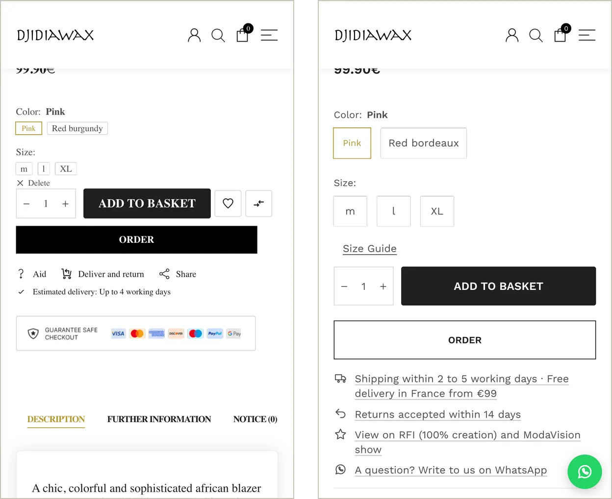
Product page on a phone, at the size buttons. Left: before. Right: after.
Checkout and trust
- Free standard delivery in France from €99 now really applies at checkout, with a “€X to go” message in the cart.
- Pre-orders can be paid for, with the 15-day lead time shown on the page and saved on the order.
- A real contact page: WhatsApp, phone, email, and a form in French.
- A privacy policy written for the tools the shop really uses, and a checkout link that goes to the real terms of sale.
- Everything in French: sorting, breadcrumbs, search, cart, filters, account, and the 404 page.
Reviews and a welcome offer
- Product reviews with photos, built into the shop with no outside widget. Seven days after an order is completed, the customer gets one email with a personal link, so only real customers can leave a review. The owner approves each one before it’s published.
- 10% off a first order in exchange for an email address: a single-use code, shown right away and sent by email. The offer appears only after scrolling, never as a pop-up on arrival.
- Wrote titles and descriptions for the home page, categories, and key pages. Products with short names (“Bomber Azur”) got a title that says what they are.
- Put 12 products in their category, removed the theme’s sample posts, and cleaned up the sitemap.
- Added alt text to 120 photos, for Google Images and for people using screen readers.
- Added product structured data (price, stock, 14-day returns), which also prepares the shop for free Google Shopping listings.
What I chose not to do
- No AI-generated images and no white backgrounds. The studio photos already match each other and show the fit.
- No pop-up on arrival, no countdown, no fake “only 2 left.” They make a brand look like a discount site, and fake urgency is against French consumer law.
- No custom code to replace WooCommerce or the payment plugins. Together they weigh about 0.5 MB. The weight was in the photos.
How it went live
Everything was built and tested on a copy of the shop first. About 40 automated tests replay the key paths on a phone and a computer: add to cart, pre-order, free delivery, the welcome offer, a review with a photo, search, and broken links. The launch took about an hour, orders kept working, and each change can be undone.
Next: bringing in more visitors, through Instagram and free Google Shopping listings.
This project is in progress. I'll add results here once there's enough data and the owner approves them.